The Haptic Web: Leveraging Sensory Feedback for Mobile Conversion Excellence
Learn how thoughtful haptic feedback can improve mobile UX, reinforce key actions, and support higher conversion rates without adding friction or gimmicks.
Free tool
Grade your website before you keep reading
Most readers want a quick benchmark first. Start with the free Website Grader, then come back to this article with a clearer sense of what to fix.
# The haptic web: leveraging sensory feedback for mobile conversion excellence
Mobile UX teams spend a lot of time polishing what users can see. They refine buttons, trim copy, speed up load times, and obsess over layout shifts. All of that matters. But on mobile, there is another layer of feedback that often gets ignored: touch.
Haptic feedback gives digital actions a physical edge. A subtle vibration can confirm that an item was added to cart, signal that a form step is complete, or make a pull-to-refresh interaction feel responsive instead of vague. Done well, haptics reduce uncertainty. And when you reduce uncertainty, you usually reduce drop-off.
That is why the haptic web deserves more attention in conversion-focused mobile design.
Why haptics matter in mobile UX
Good mobile UX is mostly about confidence. Users want to know:
Visual feedback helps answer those questions, but touch can do it faster. A short haptic cue lands instantly and does not compete with the rest of the interface for attention. It supports the moment rather than shouting over it.
This matters even more on mobile because fingers are imprecise. Screens are small. Context is messy. People browse while walking, commuting, multitasking, or half-paying attention. In those moments, a clean tactile confirmation can make the experience feel more reliable.
Reliable experiences convert better.
What the web can actually do today
On the web, haptics are not as rich as what native apps can access, but they are not imaginary either. The main browser-level tool is the Vibration API through `navigator.vibrate()`.
That API allows a device to vibrate for a set number of milliseconds or in a defined pattern. For example, a single short pulse can acknowledge one action, while a patterned pulse can mark a different state. There are practical limits, though:
That last point is important for strategy. The haptic web is not about elaborate vibration choreography. It is about small, useful signals layered onto core interactions.
In other words, think confirmation, not spectacle.
Where haptics can improve conversion
Not every tap needs a buzz. In fact, most do not. The best haptic UX shows up at moments where reassurance changes behavior.
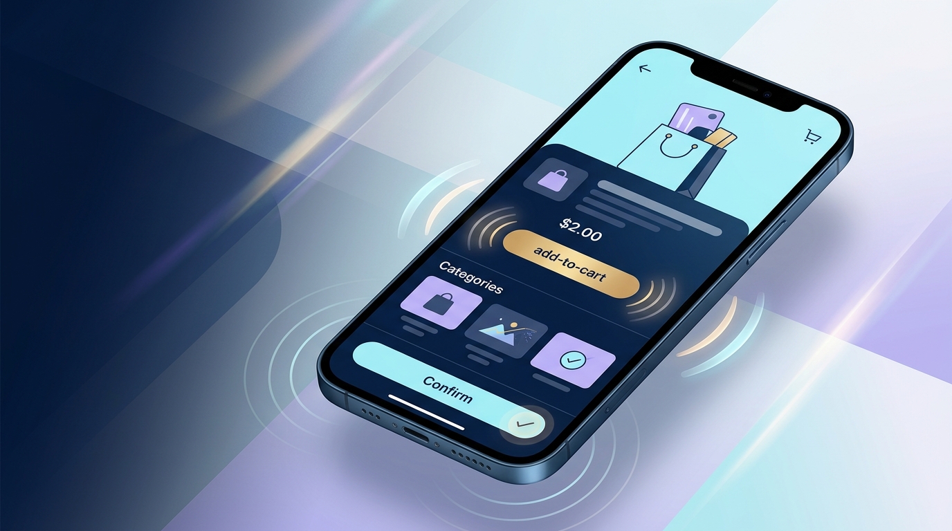
1. Add-to-cart and wishlist actions
When a user taps "Add to cart," they should never wonder whether it worked. A subtle haptic pulse paired with a visible cart update can make the action feel final.
That matters because hesitation after product selection is expensive. If users tap again, misread the result, or pause to verify the cart count, the flow gets slower and less trustworthy. Haptics help close that loop quickly.
2. Checkout step completion
Multi-step checkout is a natural fit for tactile feedback. A light pulse when a shipping step validates successfully or when payment details submit can reduce the mental friction of moving forward.
The goal is not to decorate the flow. The goal is to reinforce progress.
3. Form validation
Most form validation is still too easy to miss. Tiny red text under a field is not enough when someone is moving fast on a phone. A distinct haptic response for an error versus a successful submission can clarify what happened before the user even reads the message.
Used carefully, that can reduce repeated mistakes and rage taps.
4. Gesture-based interactions
Pull-to-refresh, swipe-to-save, swipe-to-delete, drag-and-drop sorting, and slider confirmations all benefit from tactile anchors. These interactions often feel fuzzy without a physical cue. Haptics can make the interface feel less slippery and more intentional.
5. High-trust confirmations
Account security, payment approval, booking confirmation, and order placement are emotionally loaded actions. Users want certainty. A measured haptic response at the right moment can make the experience feel more secure and complete.
That is a small design move with a surprisingly strong psychological effect.
The conversion logic behind haptic feedback
Haptics do not increase conversion by magic. They help because they improve three things that sit underneath conversion performance.
Reduced ambiguity
Ambiguity kills momentum. If a user is unsure whether a tap worked, they slow down. Haptics answer that question in a fraction of a second.
Stronger perceived responsiveness
Sometimes the system is working, but it does not feel fast. A tactile acknowledgement can shorten perceived response time even when actual response time stays the same. That is especially useful in mobile flows where network latency is visible.
Better emotional quality
Good mobile products feel crisp. They feel intentional. They feel cared for. That emotional layer affects trust, and trust affects completion rates. Haptics can make routine actions feel more grounded, especially when paired with strong visual feedback.
None of this means haptics can rescue a bad checkout. They cannot. But they can sharpen a good one.
Want a fast score before you touch the site?
Use the free Website Grader to get an instant trust, UX, SEO, and performance score, then decide if you need the full AI review.
Open the Free Website Grader →Best practices for haptic web design
If you want haptics to improve mobile conversion rather than annoy people, restraint matters more than novelty.
Use haptics for meaningful moments
Reserve tactile feedback for actions that benefit from confirmation, state change, or progress. If everything vibrates, nothing feels important.
A good rule: if the action changes commitment, status, or direction, haptics may help.
Keep signals short and distinct
Short pulses usually work better than long ones. Users should register the cue without feeling interrupted. Error states and success states should also feel different if your platform allows it, but keep the language simple.
Pair haptics with visual feedback
Haptics should support the interface, not replace it. Some browsers will not support vibration. Some users will disable it. Others may be in silent mode. Your core UX still needs to stand on its own.
This is classic progressive enhancement: build a complete experience first, then layer in haptics where supported.
Respect accessibility and user comfort
Some users find vibration distracting, unpleasant, or fatiguing. Others rely on different feedback channels entirely. Avoid frequent or aggressive patterns, and never use haptics as the only indicator of success, error, or urgency.
Inclusive design still applies when the interface touches back.
Test on real devices
Haptics are one of those things that look straightforward in a spec and behave differently in the wild. Device hardware, browser support, OS settings, and context all change the result. Test on actual phones, not just in theory.
Common mistakes teams make
A few haptic patterns show up again and again, and they usually backfire.
Treating haptics like decoration
If vibration exists just to make the product feel "premium," it often becomes noise. Users do not want a buzzing UI. They want clarity.
Overusing feedback
Too many haptic triggers make the interface feel busy and cheap. Save it for moments that carry consequence.
Ignoring browser constraints
The web does not offer the same tactile control as native platforms. Teams that design beyond what browsers can support end up with inconsistent experiences. Know the limits, especially around support and activation.
Measuring nothing
If haptics are meant to improve conversion, treat them like a hypothesis. Test them. Compare task completion, checkout progression, form error recovery, rage taps, and abandonment rates. Otherwise you are designing by intuition alone.
How to test haptics for conversion impact
A smart test plan goes beyond asking whether users "liked" the experience.
Look at:
Qualitative feedback matters too. Ask whether users felt confident, clear on system status, and certain that actions had completed. Those signals often explain the numbers.
One caution: if you run an experiment, segment by browser and device support. A haptics test is not meaningful if half the audience cannot receive the treatment.
The future of sensory design on the web
The haptic web is still limited compared with native mobile platforms, but the broader direction is clear. Mobile UX is becoming more sensory, more responsive, and less purely visual. Sound, motion, touch, and microinteraction design increasingly work together.
That shift is good news for conversion teams. It means we can move beyond blunt patterns like bigger buttons and louder CTAs. We can design interactions that feel more certain, more human, and easier to trust.
And trust is where conversions often begin.
Final thought
Haptic feedback is not a gimmick when it solves a real UX problem. On mobile, that problem is often uncertainty. Did the tap work? Did the form go through? Did the order complete?
A short, well-placed tactile cue can answer those questions faster than text and more quietly than animation.
That is the real opportunity in the haptic web. Not novelty. Not flash. Just better mobile UX with less doubt and more forward motion.
If you are serious about mobile conversion excellence, it is worth asking a simple question: where in your funnel would a little more certainty help users say yes?
Turn this article into a real benchmark
Start with the free Website Grader for an instant score, then move to the full AI scan when you want page-level recommendations.
Open the Free Website Grader →