Landing page trust signals in the AI era: how to look credible without looking generic
A practical guide to landing page trust signals for 2026, with examples of what actually reduces hesitation and what makes a page feel templated, vague, or fake.
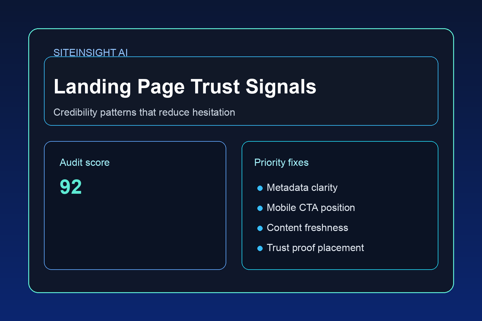
Free tool
Grade your website before you keep reading
Most readers want a quick benchmark first. Start with the free Website Grader, then come back to this article with a clearer sense of what to fix.
# Landing page trust signals in the AI era: how to look credible without looking generic
There is a strange problem on the modern web.
It has never been easier to make a page look polished, and it has rarely been harder to make a page feel believable.
Templates are better. AI copy tools are faster. Stock photography is cleaner. Design systems are more refined. Yet a lot of landing pages still create the same reaction in visitors: this looks nice, but I do not quite trust it.
That hesitation is expensive.
Most landing pages do not lose conversions because the call to action is invisible. They lose conversions because the visitor has one or two unanswered doubts, and the page never resolves them. In 2026, with more AI-generated copy, cloned layouts, and vague promises online, that trust gap matters even more.
If your landing page feels polished but underperforms, trust signals are one of the first things worth checking.
What trust signals really do
Trust signals are not decorative extras. They reduce uncertainty.
When somebody lands on your page, they are usually trying to answer a short list of questions:
A strong landing page answers those questions before the visitor has to go hunting for reassurance.
The trust problem created by AI sameness
The rise of AI content has made one issue much sharper: many pages now sound interchangeable.
You have probably seen the pattern:
Nothing on the page is obviously wrong. It just feels frictionless in the wrong way, as if it was assembled to resemble credibility instead of earning it.
That is why generic trust signals no longer work as well on their own. Saying "trusted by leading brands" without showing context is weak. Showing five stars without any story behind them is weak. A slick mockup without proof of outcomes is weak.
Visitors have become better at sensing when a page is optimized before it is grounded.
The trust signals that still work
1. Specific positioning
The first trust signal is clarity.
A vague headline creates doubt immediately. If your page says "We help ambitious businesses grow online," the visitor still has to figure out whether you are relevant.
A clearer version might say:
Specificity reassures people because it suggests you know what kind of problem you solve.
2. Real proof close to the claim
If you make a promise, support it nearby.
For example, if your headline says you improve lead quality, the page should not wait until the footer to mention evidence. Put a proof point, client quote, mini case study, or before-and-after example close to the claim.
This is one of the simplest ways to reduce bounce and hesitation.
3. Testimonials that sound like people
Many testimonials fail because they are too tidy.
Good testimonials usually include at least one of these:
"Amazing service, highly recommend" does almost nothing.
"We were getting traffic but hardly any enquiries. After the page rewrite and form changes, we started getting better leads within a few weeks" is more believable because it reflects an actual before-and-after.
4. Process transparency
A lot of visitors hesitate because they do not know what happens after they click.
If your CTA is "Book a strategy call," explain what that means.
Process clarity is a trust signal because it removes fear of hassle.
5. Visible business identity
This sounds basic, but many landing pages still hide obvious identity markers.
Useful signals include:
People do not always need a deep About page before converting, but they do need enough evidence that there is a real business on the other side.
6. Honest scope
One of the most underrated trust signals is restraint.
If you clearly say who your offer is for, and who it is not for, the page often becomes more persuasive. Boundaries make an offer feel more real.
For example:
That kind of honesty reduces suspicion.
Design choices that quietly affect trust
Trust is not just about copy. Layout matters too.
Repetition of the same CTA block
If every section ends with the same hard sell, the page can feel pushy before it feels convincing.
Overdesigned hero sections
When the hero is visually impressive but vague on substance, visitors often interpret that as style covering for uncertainty.
Too much motion or too many badges
Animation, counters, and logos can help, but too much of it starts to feel performative.
Weak information hierarchy
If the user cannot quickly find proof, pricing cues, FAQs, or next steps, trust drops because the page feels evasive.
What fake trust looks like now
This is worth naming directly.
A landing page often feels fake when it relies on borrowed signals rather than earned ones.
Examples:
In other words, trust fails when the page looks optimized for impression management rather than decision-making.
A simple landing page trust audit
If you want to improve a page without redesigning everything, review it using these questions.
Above the fold
Mid-page
Before the CTA
That quick audit catches a surprising amount.
The pages that convert best usually feel calmer
This is the part many businesses miss.
High-trust landing pages often feel less like marketing and more like orientation. They do not overwhelm the visitor with persuasion. They help the visitor get their bearings.
The page says, in effect:
Here is what this is. Here is who it helps. Here is the evidence. Here is how it works. Here is what to do next if it fits.
That calmness matters because trust grows when the page feels secure enough not to oversell itself.
The bigger takeaway
In the AI era, credibility is becoming easier to imitate at a glance and harder to sustain under attention.
That is why the best landing page trust signals are not the flashy ones. They are the grounded ones.
Clarity. Specificity. Real proof. Honest process. A visible human behind the page. Enough context for the visitor to make a sensible decision.
If your landing page already looks professional, that is fine. Keep it.
Then ask the more useful question: does it feel true?
That is usually where the next conversion gains are hiding.
Turn this article into a real benchmark
Start with the free Website Grader for an instant score, then move to the full AI scan when you want page-level recommendations.
Open the Free Website Grader →