Perceptual Speed: Why Your Website Feels Slow Even at 2 Seconds
In the world of e-commerce and digital products, we are obsessed with milliseconds. We optimize images, minify CSS, and leverage edge computing—all to shave a fraction...
Free tool
Grade your website before you keep reading
Most readers want a quick benchmark first. Start with the free Website Grader, then come back to this article with a clearer sense of what to fix.
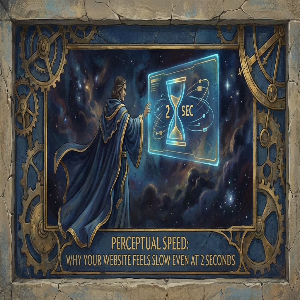
# Perceptual Speed: Why Your Website Feels Slow Even at 2 Seconds
In the world of e-commerce and digital products, we are obsessed with milliseconds. We optimize images, minify CSS, and leverage edge computing—all to shave a fraction of a second off our load times. But here is the hard truth: your users don't have a stopwatch. They have a feeling.
Perceptual speed is the subjective experience of how fast a website feels, and it often matters more than the actual technical load time. A site that loads in 2 seconds but feels "jittery" or "stuck" will frustrate users more than a site that takes 3 seconds but provides immediate visual feedback.
The Psychology of the Wait
Humans perceive time differently based on their level of engagement and the type of feedback they receive. There are three critical thresholds in human-computer interaction:
If your site hits the 2-second mark, you’ve technically missed the "uninterrupted" window. This is where perceptual optimization becomes your most powerful tool.
Tactics to Improve Perceptual Speed
1. Skeleton Screens over Spinners
Spinners and progress bars draw attention to the wait. They are a visual reminder that the content isn't there yet. Skeleton screens—blank versions of the page that gradually fill in—create the illusion that the content is already loading and that the site is responsive.
Want a fast score before you touch the site?
Use the free Website Grader to get an instant trust, UX, SEO, and performance score, then decide if you need the full AI review.
Open the Free Website Grader →2. Optimistic UI Updates
When a user clicks "Add to Cart," don't wait for the server to respond before updating the UI. Update the button state or the cart icon immediately. If the server call fails, you can revert the state gracefully. This makes the interaction feel instantaneous.
3. Progressive Image Loading
Blurry placeholders or Low-Quality Image Placeholders (LQIP) provide immediate visual context. The user understands what is coming, which reduces the anxiety of waiting for a large hero image to appear.
4. Interactive Pre-fetching
Start loading the next page as soon as a user hovers over a link. By the time they actually click, half the work is already done. To the user, the transition feels like magic.
Why It Matters for Your Bottom Line
Conversion rate optimization (CRO) is as much about trust as it is about speed. When a site feels sluggish or unresponsive, it subtly erodes the user's trust in the brand. A "fast-feeling" site projects competence and reliability.
Stop focusing exclusively on your Lighthouse score. Start looking at your site through the eyes of a distracted user on a mobile device. If it doesn't feel fast, it isn't fast enough.
---
Optimizing your site's performance? Contact SiteInsight AI for a comprehensive audit of your perceptual speed and technical load times.
Turn this article into a real benchmark
Start with the free Website Grader for an instant score, then move to the full AI scan when you want page-level recommendations.
Open the Free Website Grader →