The Mobile Checkout Killers: 5 E-commerce Mistakes Tanking Your 2026 Conversions
Is your mobile checkout leaking revenue? Discover the top e-commerce mistakes in 2026 and how to fix them for maximum conversion.
Free tool
Grade your website before you keep reading
Most readers want a quick benchmark first. Start with the free Website Grader, then come back to this article with a clearer sense of what to fix.
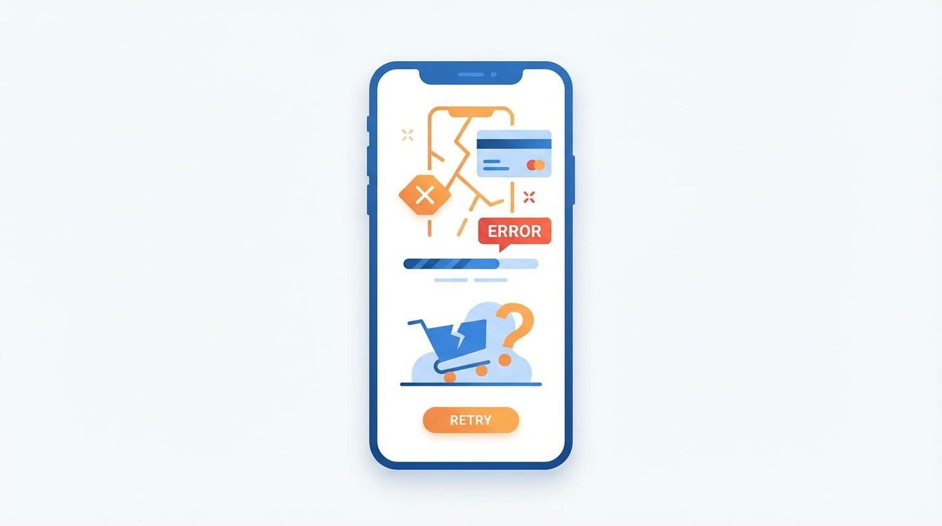
Mobile e-commerce has officially moved beyond "nice to have" to "primary storefront." In 2026, mobile abandonment rates are hovering near 85%, and the culprit isn't usually your product—it's your checkout.
If your mobile checkout feels like a digital obstacle course, your customers will simply jump ship to a competitor who makes it easier to give them money. Here are the five biggest mobile checkout killers we're seeing this year and how to neutralize them.
1. The "Account Mandatory" Wall
Still forcing guest users to create an account before they can pay? You're essentially putting a padlock on your cash register. In 2026, 37% of shoppers abandon carts because of forced registration.
**The Fix:** Implement guest checkout as the default. If you want them to create an account, offer a "Save my details for next time" checkbox *after* the payment is complete.
2. Form Fatigue (The 11-Field Trap)
The average checkout still asks for over 11 form fields. On a desktop, that's a chore. On a mobile device with a virtual keyboard, it's a reason to quit. Every extra field you add is a leak in your conversion funnel.
**The Fix:**
3. The Digital Wallet Deficit
If you aren't offering Apple Pay, Google Pay, or Link by Stripe, you're making your customers find their physical wallets. In a "thumb-driven" economy, the person who has to type in a 16-digit card number is the person who abandons the purchase.
Want a fast score before you touch the site?
Use the free Website Grader to get an instant trust, UX, SEO, and performance score, then decide if you need the full AI review.
Open the Free Website Grader →**The Fix:** Place Express Checkout buttons at the *top* of the checkout page. Let them finish the transaction in two taps.
4. Surprise Shipping Fees
Transparency is the new trust. Finding out about a $15 shipping fee only after entering an address is the #1 reason for "sticker shock" abandonment.
**The Fix:** Calculate shipping as early as possible. If you can't offer free shipping, display a "Shipping Calculator" on the cart page or offer a flat-rate early in the process.
5. Micro-Friction: Tiny Tap Targets
In 2026, "thumb-driven design" is the standard. If your "Place Order" button is too close to a "Cancel" link, or if your form fields are too small to tap accurately, you're creating physical frustration.
**The Fix:** Ensure all interactive elements are at least 44x44 pixels. Give your checkout buttons enough breathing room (white space) to avoid accidental clicks.
---
**Is your mobile site ready for the 2026 shopper?**
At SiteInsight AI, we specialize in identifying these friction points before they cost you a sale. [Run a free mobile audit today.](/)
Turn this article into a real benchmark
Start with the free Website Grader for an instant score, then move to the full AI scan when you want page-level recommendations.
Open the Free Website Grader →