The Psychology of Friction: Designing Landing Pages That Convert in 2026
The mantra for the last decade of web design was simple: *"Remove all friction."* The faster a user could click 'Buy' or 'Sign Up,' the better.
Free tool
Grade your website before you keep reading
Most readers want a quick benchmark first. Start with the free Website Grader, then come back to this article with a clearer sense of what to fix.
The mantra for the last decade of web design was simple: *"Remove all friction."* The faster a user could click 'Buy' or 'Sign Up,' the better.
But in 2026, the landscape has changed. Users are more skeptical, AI-overwhelmed, and privacy-conscious. We’ve discovered that **friction isn't always a bug—sometimes it’s a feature.**
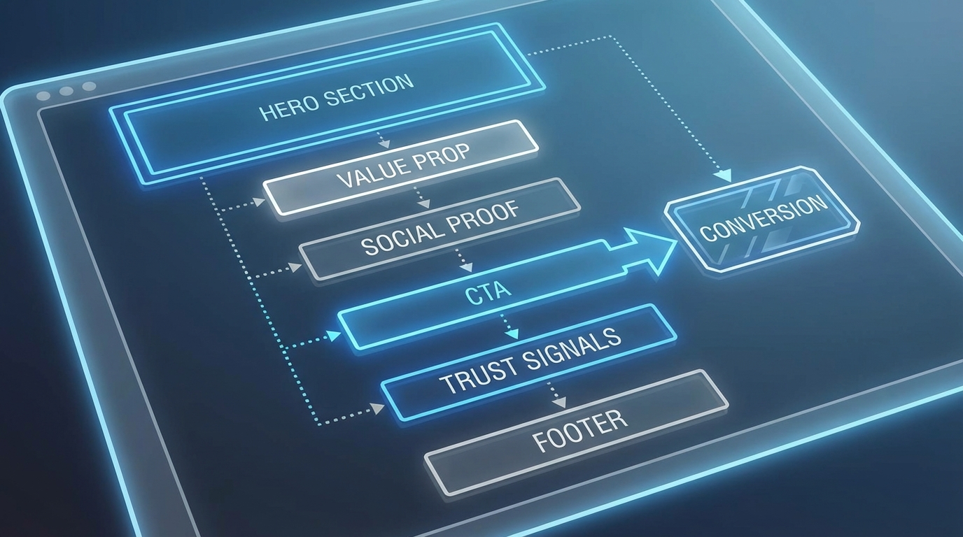
The psychology behind high-converting landing pages today isn't just about speed; it's about **Cognitive Fluency** and **Strategic Friction.**
1. Cognitive Fluency: The Power of 'Easy'
Cognitive fluency is the ease with which our brains process information. If a landing page is easy to read, we subconsciously assume the product is easy to use and the brand is trustworthy.
* **Z-Pattern Scanning:** Our brains naturally scan a new page in a 'Z' shape. Place your logo at the top-left, a secondary call-to-action (CTA) or login at the top-right, your hero statement in the middle, and your primary CTA button at the bottom-right.
* **The Power of 'My':** A small psychological shift can have a massive impact. Changing a button from *"Get Your Free Audit"* to *"Get My Free Audit"* increases CTR by helping the user mentally 'own' the result before they click.
* **Authentic Visuals over Stock:** In 2026, stock photos are a trust-killer. Our brains are trained to filter out generic images. Use real product screenshots, raw video testimonials, or high-quality custom photography to build immediate credibility.
2. Strategic Friction: Quality over Quantity
Sometimes, a lead who converts *too* easily isn't a good lead. Strategic friction is the intentional slowing down of the user journey to increase lead quality and commitment.
* **Multi-Step Forms:** Instead of a long, intimidating form, break it into 3-4 simple questions. This uses the **Sunk Cost Fallacy**: once a user has answered three easy questions, they're 60% more likely to provide their email address at the end.
* **The Quiz Funnel:** By asking users to categorize their needs before seeing a pricing page, you provide a personalized experience that makes the eventual offer feel tailor-made.
3. Social Proof 3.0: The Authority Bias
In an era of AI-generated reviews, "Social Proof" has evolved. Simple star ratings are no longer enough.
* **Detailed Case Studies:** Users want to see the 'Before' and 'After.' Show the data, the timeline, and the specific problem you solved.
* **Third-Party Verifications:** Trust badges from security providers (Zero-Trust) or industry associations carry more weight than ever as a signal of real-world authority.
4. Tactile Maximalism: The Design Shift
While minimalism dominated the 2010s, 2026 is the year of **Tactile Maximalism.** This means using rich textures, vibrant contrasts, and editorial-style layouts to make a digital page feel physically real.
This design style works because it interrupts the 'endless scroll' of generic SaaS templates. It demands attention and creates a memorable brand impression.
Conclusion: The Human Element
Behind every click is a human brain making a split-second decision based on millions of years of evolution. By aligning your landing page with these psychological principles—clarity, trust, and intentional commitment—you aren't just 'optimizing' a page; you're building a relationship. 🌌✨🔮
Turn this article into a real benchmark
Start with the free Website Grader for an instant score, then move to the full AI scan when you want page-level recommendations.
Open the Free Website Grader →