The Architecture of a High-Converting Landing Page
Breaking down the essential design elements that drive conversion in 2026, from cognitive load management to adaptive UI.
Free tool
Grade your website before you keep reading
Most readers want a quick benchmark first. Start with the free Website Grader, then come back to this article with a clearer sense of what to fix.
# The Architecture of a High-Converting Landing Page
Landing pages in 2026 have evolved beyond simple "catch-all" headers and big CTA buttons. In an age of infinite distraction, the most successful pages are those that respect the user's **cognitive load** and provide an **adaptive experience**.
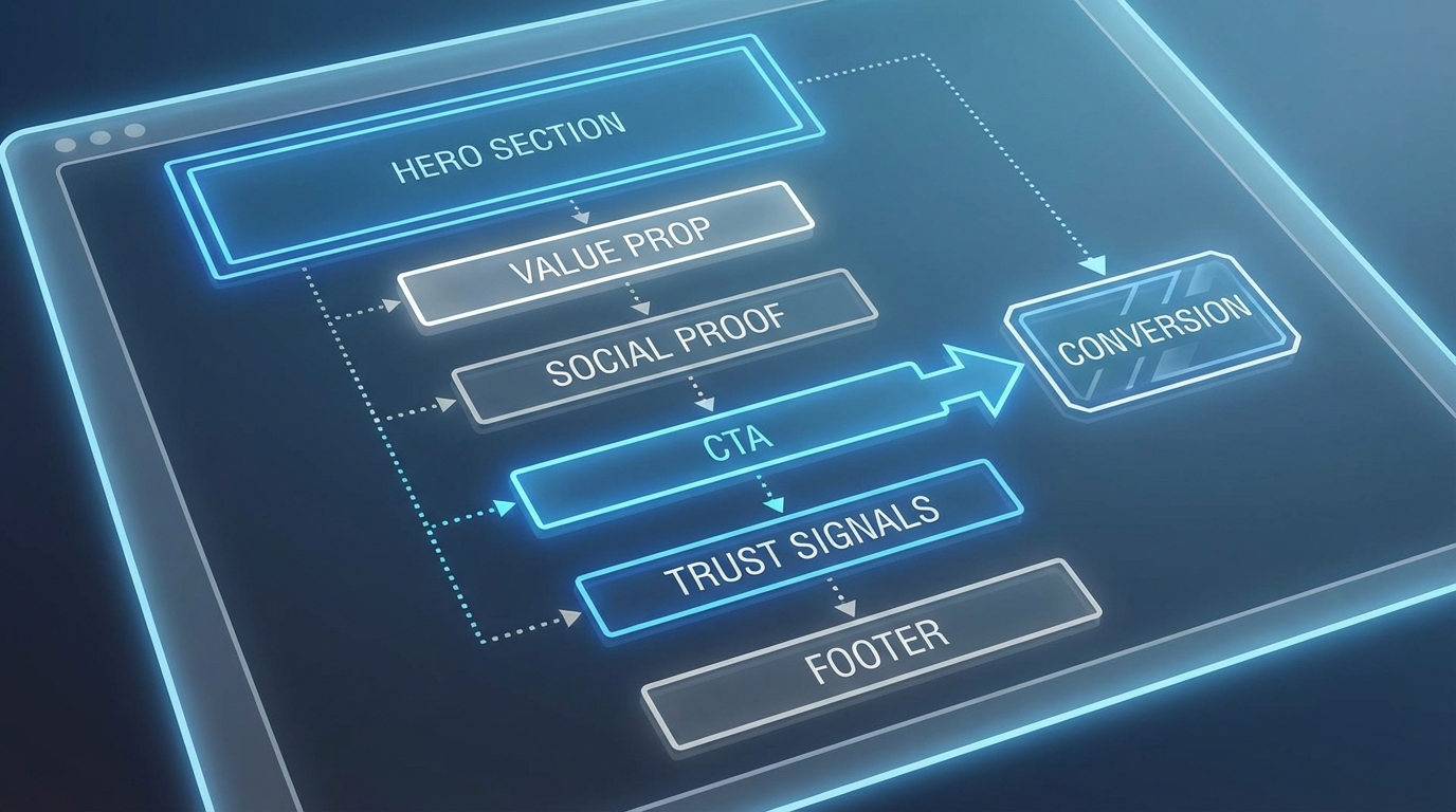
The Foundation: Cognitive Ease
A user should know what your page is about within three seconds. If they have to work to understand your value proposition, you've already lost them.
1. The Narrative Hero Section
Your hero section shouldn't just list features; it should state the transformation.
2. Adaptive Visual Hierarchy
Modern landing pages use AI to adjust the layout based on the user's referral source. If a user comes from a technical blog, the page highlights deep-dive stats. If they come from Instagram, it leads with social proof and visual impact.
The Pillars of Conversion
Trust Signals 2.0
Stock logos of "As Seen On" are no longer enough. Users want real-time social proof.
The Frictionless Path
Conclusion
Design is not just how it looks; it's how it converts. By focusing on the psychology of the user journey and leveraging adaptive design principles, you can create landing pages that don't just attract attention—they inspire action. ✨
Turn this article into a real benchmark
Start with the free Website Grader for an instant score, then move to the full AI scan when you want page-level recommendations.
Open the Free Website Grader →