Thumb-Driven Design: Eliminating Mobile UX Friction in 2026
Mobile commerce in 2026 is the default, not the alternative. However, many stores still treat mobile as a 'shrunken desktop' experience. To compete, businesses must em...
Free tool
Grade your website before you keep reading
Most readers want a quick benchmark first. Start with the free Website Grader, then come back to this article with a clearer sense of what to fix.
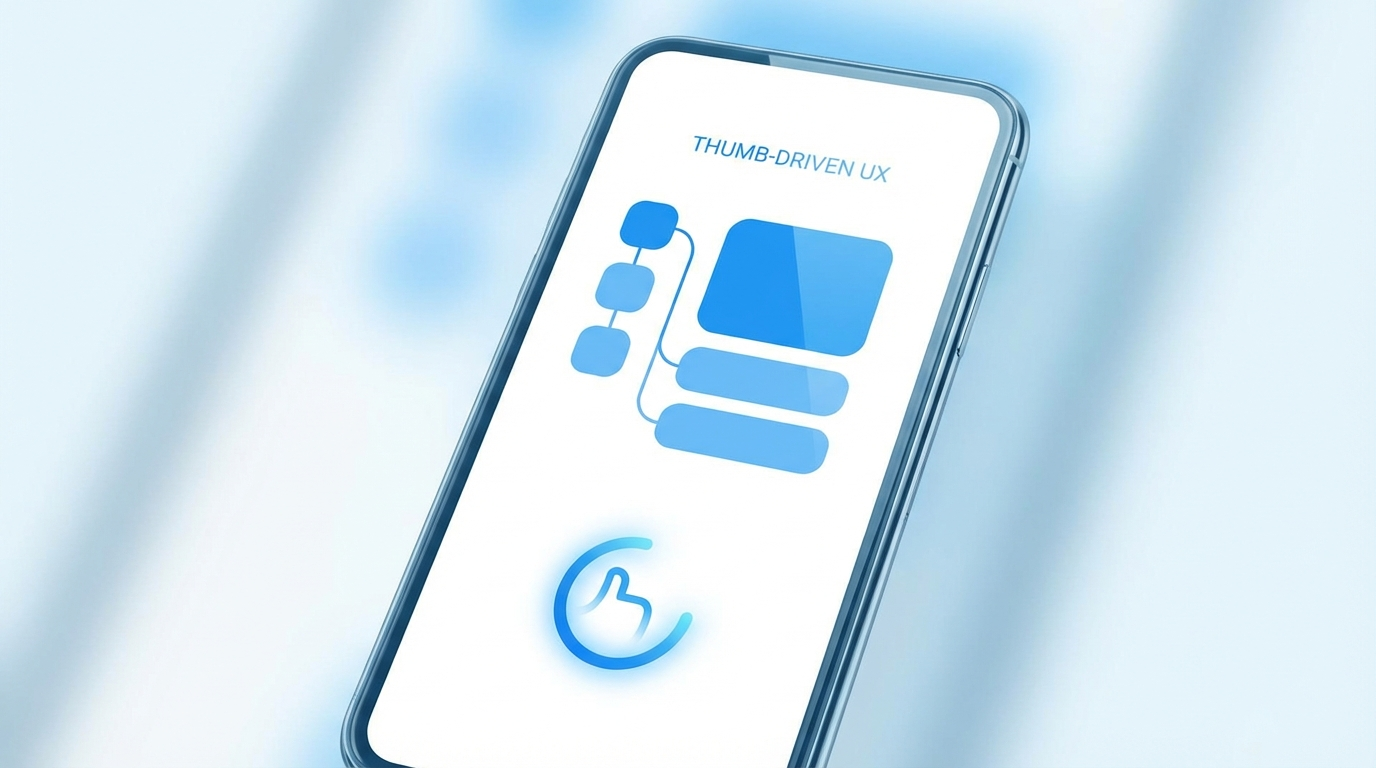
Mobile commerce in 2026 is the default, not the alternative. However, many stores still treat mobile as a 'shrunken desktop' experience. To compete, businesses must embrace **Thumb-Driven Design**—optimizing every interaction for the natural range of motion of a user's thumb.
The Problem: Cognitive Load and Feature Overload
One of the biggest conversion killers in 2026 is 'Feature Overload.' On a small screen, every additional button or form field increases the cognitive load on the user. If the path to purchase feels like work, the user will abandon.
Key Mobile UX Mistakes to Avoid:
The Solution: The Thumb Zone
High-value actions—like 'Add to Cart' or 'Pay Now'—must be placed within the 'Green Zone' (the area most easily reached by the thumb when holding a phone with one hand).
Accessibility as a Growth Lever
In 2026, accessibility isn't just a legal requirement; it's a conversion strategy. Ensuring large touch targets, high contrast, and screen-reader compatibility expands your market to every potential customer.
**Conclusion:** The smaller the screen, the larger the friction. Solve for the thumb, and the sales will follow.
Turn this article into a real benchmark
Start with the free Website Grader for an instant score, then move to the full AI scan when you want page-level recommendations.
Open the Free Website Grader →