E-commerce2026-03-183 min read
Why your store is losing money at the very last step—and how to stop the bleed.
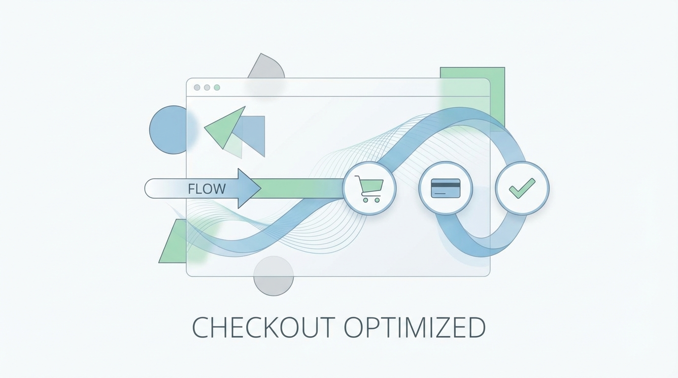
# The E-commerce Checkout Friction Audit: 10 Conversion Killers You're Ignoring
You've spent thousands on ads. You've optimized your product pages. You have "Social Proof" all over your site. And yet, your cart abandonment rate is hovering at 75%. Why? Because your checkout is a series of tiny, painful friction points. In 2026, the checkout is no longer a "process"—it should be an "event."
The Psychology of Abandonment
The moment a user hits "Checkout," their brain shifts from "Dopamine-driven shopping" to "Anxiety-driven spending." If you give them even one second to reconsider, they will.
10 Friction Points to Eliminate Today
**Mandatory Account Creation:** If you force a user to create an account before they can pay, you are telling them you value their data more than their money.**Surprise Shipping Costs:** If the price changes at the very last step, the trust is broken. Use IP-based estimates or "Free Shipping" tiers to avoid this.**Lack of One-Tap Payments:** If I can't pay with Apple Pay, Google Pay, or Shop Pay in one tap, your checkout is 10 years too old.**Form Over-Asking:** Do you really need their phone number? Their middle name? Their "how did you hear about us"? If it isn't required to ship the product, delete the field.**Lack of Progress Indicators:** If the user doesn't know how many steps are left, they will assume there are 50. Show them the finish line.**Trust Seal Overload:** Ironically, too many "Secure Checkout" badges can make a site look suspicious. Pick one or two "Gold Standard" seals and keep it clean.**Mobile Keyboard Mismatch:** If a user clicks a "Phone Number" field and the *alpha* keyboard pops up instead of the *numeric* one, you just added 5 seconds of friction.**Vague Error Messages:** "An error occurred" is a death sentence for a sale. Be specific: "Your CVV is 3 digits."**No Post-Purchase Clarity:** Does the "Pay Now" button actually confirm the order? If it spins for 10 seconds without a "Success!" message, users will refresh and double-order.**Discount Code Distraction:** If you have a giant "Enter Promo Code" box, users will leave your site to go find one on Google. Hide it behind a small "Have a code?" link.The 2026 Gold Standard: The Zero-Click Checkout
The best checkout is the one that happens almost invisibly. By 2026, the stores that win are the ones that remember the user's preferences across devices and make the "Buy" button a literal one-step process.
Turn this article into a real benchmark
Start with the free Website Grader for an instant score, then move to the full AI scan when you want page-level recommendations.
Open the Free Website Grader →