Mobile-First CRO: Thumb-Driven Design for 2026
In 2026, mobile devices are no longer just a secondary channel; they are the primary point of contact for over 75% of e-commerce traffic. However, despite this dominan...
Free tool
Grade your website before you keep reading
Most readers want a quick benchmark first. Start with the free Website Grader, then come back to this article with a clearer sense of what to fix.
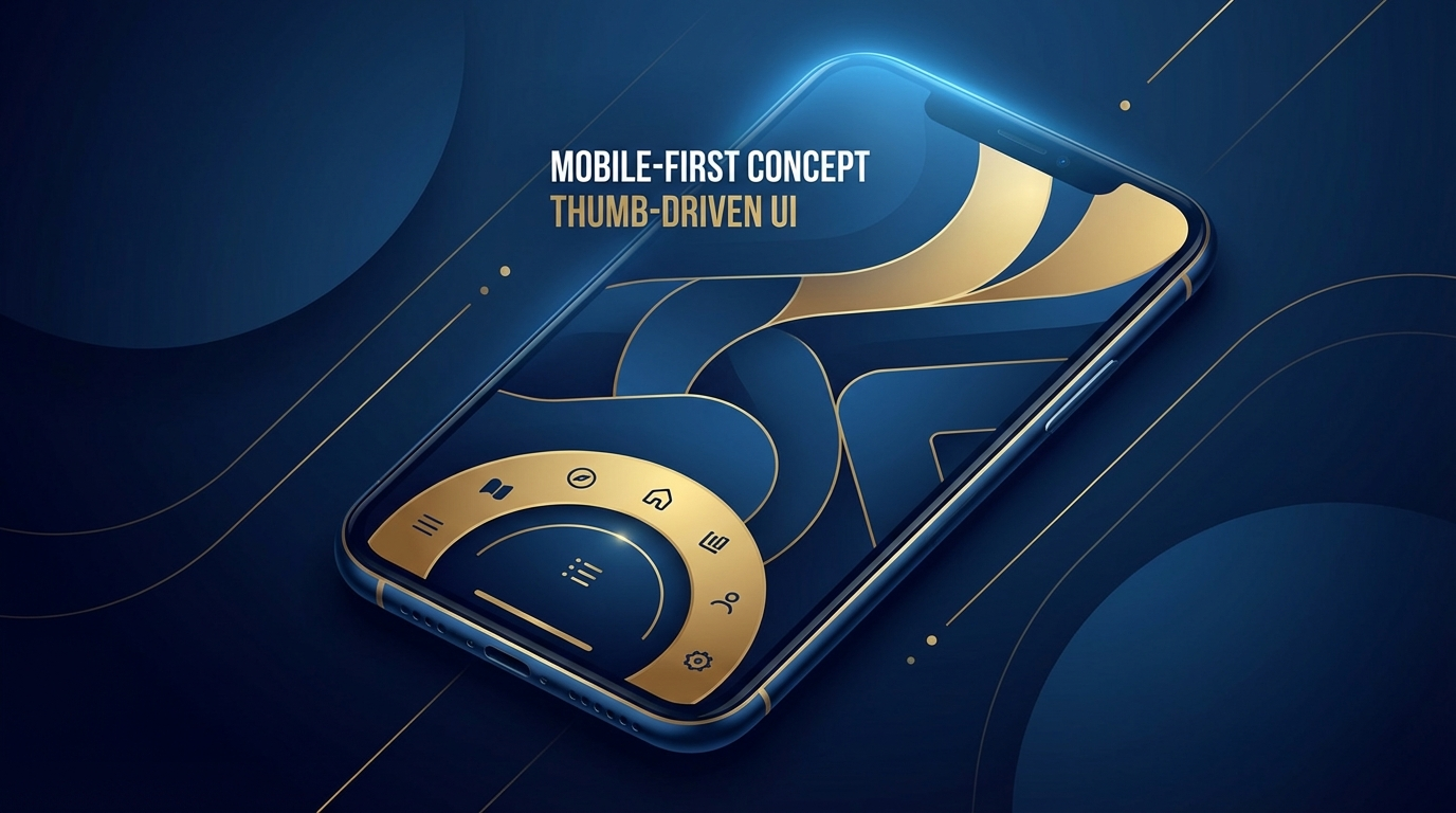
In 2026, mobile devices are no longer just a secondary channel; they are the primary point of contact for over 75% of e-commerce traffic. However, despite this dominance, mobile conversion rates consistently lag behind desktop. The reason? Most mobile experiences are still desktop designs squeezed into smaller screens. To dominate in 2026, businesses must pivot to "Thumb-Driven Design"—a user experience philosophy centered on the ergonomics of how we actually hold our phones.
The Ergonomics of Conversion
Most users navigate their phones with a single hand, using their thumb to scroll, tap, and interact. If your primary Call to Action (CTA) or navigation menu is buried in the top-left corner, you're asking the user to perform "finger gymnastics" just to buy your product. In 2026, the "Natural Reach Zone" (the bottom half of the screen) is where conversions happen.
Key Strategies for Thumb-Driven Design:
Beyond Layout: Performance-First UX
Speed is the ultimate conversion killer. By 2026, users expect "instant-on" experiences. A one-second delay in mobile load time can slash conversions by 7%. Optimization isn't just a technical task; it's a design requirement. Minimalist, clarity-driven layouts that prioritize the critical path—removing heavy background scripts and unnecessary decorative elements—are the hallmark of 2026’s top-converting mobile sites.
The Role of Micro-Interactions
In a mobile-first world, visual feedback is crucial. Subtle animations that confirm a button press or indicate a successful "add to cart" action build trust and momentum. These micro-interactions provide the emotional payoff that keeps a user moving toward the checkout.
Turn this article into a real benchmark
Start with the free Website Grader for an instant score, then move to the full AI scan when you want page-level recommendations.
Open the Free Website Grader →