5 E-commerce UX Mistakes Killing Your 2026 Conversions
The e-commerce landscape of 2026 is unforgiving. With the rise of AI-driven shopping assistants and hyper-personalized discovery, the friction points that were "annoyi...
Free tool
Grade your website before you keep reading
Most readers want a quick benchmark first. Start with the free Website Grader, then come back to this article with a clearer sense of what to fix.
The e-commerce landscape of 2026 is unforgiving. With the rise of AI-driven shopping assistants and hyper-personalized discovery, the friction points that were "annoying" in 2024 are now absolute deal-breakers. If your store hasn't updated its UX strategy recently, you're likely bleeding revenue through these five common pitfalls.
1. Mandatory Account Creation
In an era of one-click checkout and digital wallets, forcing a user to "create an account" before they can see shipping costs is the fastest way to trigger cart abandonment. 2026 shoppers expect a frictionless guest checkout. If you want their data, earn it *after* the sale with a "one-click account creation" option on the thank-you page.
2. 'Ghost' Trust Signals
In 2026, trust is the primary currency. A generic SSL badge isn't enough. Users are looking for social proof integrated directly into the UX—live purchase feeds, verified video reviews, and transparent "estimated delivery" dates that update based on their real-time location. If your trust signals look like stock icons from 2018, your conversion rate will reflect that.
3. The Unscannable Product Page
Mobile users don't read; they scan. If your product description is a 500-word wall of text, you've already lost them. High-converting product pages in 2026 use structured bullet points, "at-a-glance" feature boxes, and high-impact micro-copy that answers the "Why should I care?" question in under three seconds.
4. Generic 'One-Size-Fits-All' Experiences
Static websites are dying. In 2026, users expect a personalized journey. A lack of AI-driven recommendations based on browsing history or current intent makes your brand feel out of touch. If a returning customer sees the same hero banner as a first-time visitor, you're missing a massive opportunity for conversion.
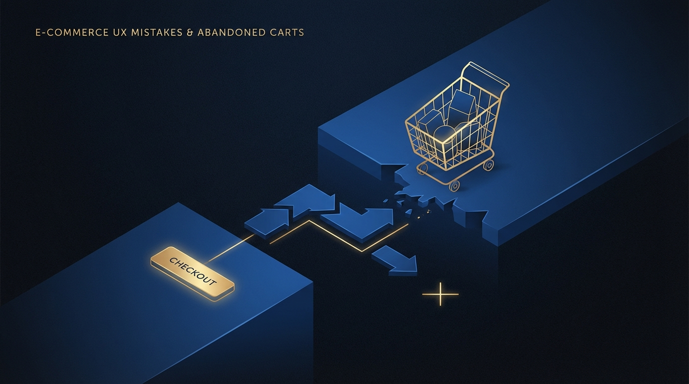
5. Friction-Heavy Checkout
Every extra field in your checkout form is a chance for the user to change their mind. 2026's winners use address autocomplete, automatic credit card detection, and support for every major digital wallet (Apple Pay, Google Pay, and BNPL options like Klarna/Afterpay). If your checkout takes more than 30 seconds, it's too long.
Turn this article into a real benchmark
Start with the free Website Grader for an instant score, then move to the full AI scan when you want page-level recommendations.
Open the Free Website Grader →