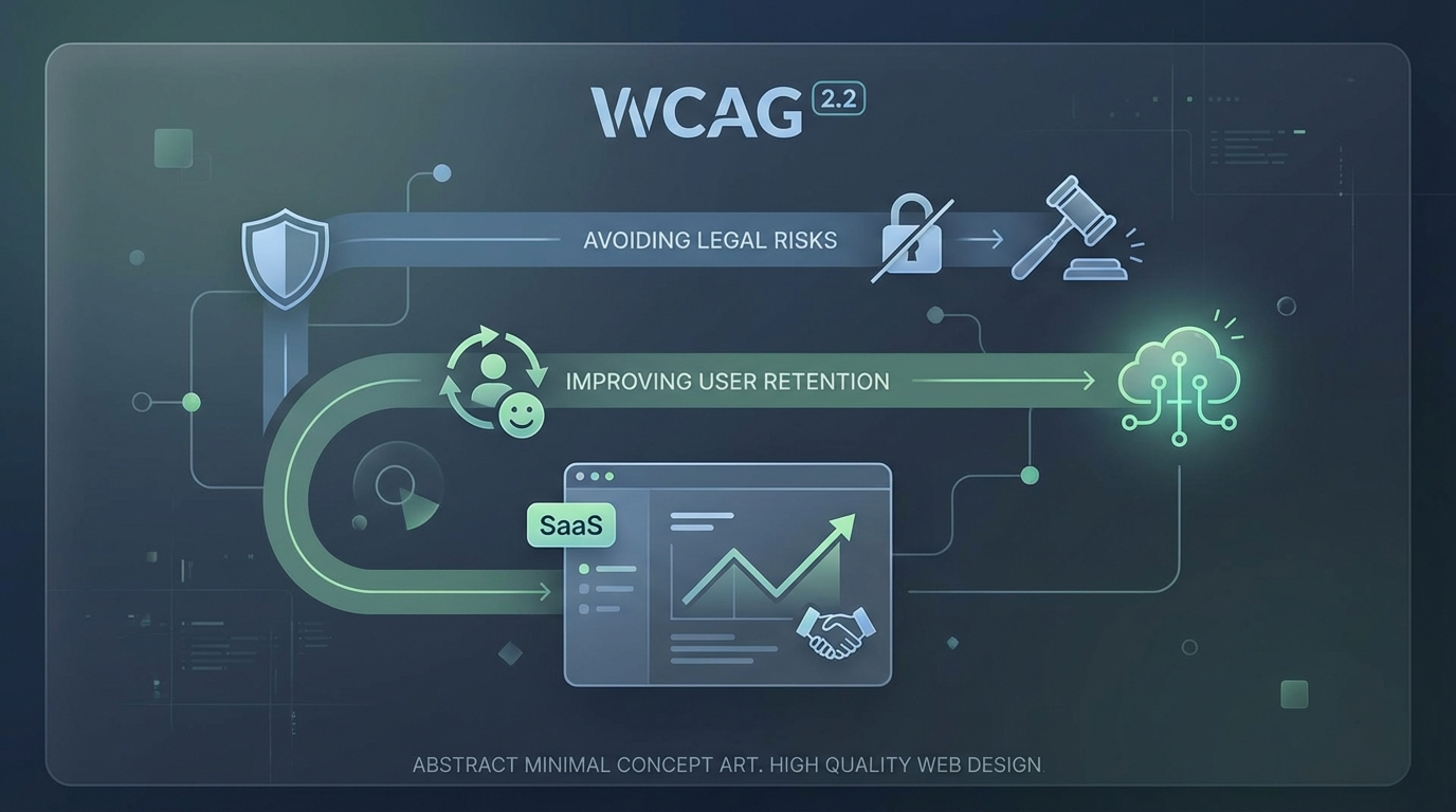
WCAG 2.2 for SaaS: Avoiding Legal Risks While Improving User Retention
Why WCAG 2.2 matters for SaaS in 2026, from legal exposure and procurement pressure to better usability, lower churn, and stronger product trust.
Free tool
Grade your website before you keep reading
Most readers want a quick benchmark first. Start with the free Website Grader, then come back to this article with a clearer sense of what to fix.
Accessibility still gets treated like a compliance chore in too many SaaS companies.
That is a mistake for two reasons.
First, the legal pressure is real. If your product serves public sector buyers, enterprise customers, or users in regulated markets, accessibility is no longer a nice-to-have tucked into a backlog. It is increasingly part of procurement, risk review, and brand credibility.
Second, the product upside is bigger than many teams realise. A SaaS platform that is easier to navigate, easier to read, easier to operate by keyboard, and more forgiving for people with cognitive or motor challenges is usually better for everyone. Better accessibility often translates into less friction, smoother onboarding, and stronger retention.
That is why WCAG 2.2 matters. Not just because legal teams care. Because product teams should.
Why WCAG 2.2 matters more in 2026
WCAG 2.2 became a meaningful line in the sand because it sharpened guidance around common real-world barriers that many modern products still create.
For SaaS teams, this matters in a context that is changing quickly:
Even when the law references WCAG 2.1 AA directly, market expectations often move ahead of the minimum. If a customer, auditor, or procurement team is already asking whether your product aligns with WCAG 2.2, “we meet an earlier version” is not a very strong answer.
In practice, accessibility has become part legal shield, part commercial signal.
Compliance is only half the story
A narrow compliance mindset leads to the wrong behaviour.
Teams audit once, fix obvious issues, document progress, and then move on as if accessibility were a certification badge rather than an ongoing quality standard. That usually produces brittle progress.
The better approach is to treat accessibility as product hygiene.
When you do that, WCAG 2.2 becomes more than a checklist. It becomes a framework for identifying where your interface makes people work harder than necessary.
That has direct retention implications.
Users do not always leave because a feature is missing. Sometimes they leave because the product feels tiring. Hard to focus. Easy to misclick. Annoying to recover from. Impossible to use smoothly with assistive tech, keyboard navigation, password managers, or zoomed interfaces.
Those are accessibility problems, but they are also churn problems.
The WCAG 2.2 areas SaaS teams should pay close attention to
A full review should cover the whole standard, but a few areas are especially relevant for SaaS products.
Focus appearance and visible focus
Keyboard users need to see where they are.
That sounds obvious, yet many dashboards, modals, filters, and design systems still ship with weak or inconsistent focus states. In dense SaaS interfaces, losing track of focus is more than inconvenient. It makes the product feel unstable.
WCAG 2.2 raises the bar around focus visibility because a faint outline or partially hidden state is not enough.
For SaaS, this affects:
If your interface is only comfortable with a mouse, it is not robust enough.
Target size
Small click targets are one of the quietest usability failures on the web.
In a SaaS product, they show up everywhere: icon buttons in tables, tiny dismiss controls, cramped pagination, close icons, chip removals, mobile nav actions. WCAG 2.2 pushes teams to make interactive elements large enough to use reliably.
This is often framed as an accessibility issue for people with motor impairments, and it is. But it also helps ordinary users on laptops, touchscreens, trackpads, and busy workdays. Less precision required means fewer mistakes.
Fewer mistakes usually means less frustration.
Dragging movements
Modern SaaS products love drag-and-drop.
Kanban boards, dashboards, upload flows, reorderable lists, calendar interfaces, page builders. The problem is that dragging can be difficult or impossible for some users.
WCAG 2.2 says that where dragging is used, there should usually be a simpler pointer alternative unless dragging is essential. That is a useful product design discipline.
It forces teams to ask: do users really need to drag this, or did we just default to the fashionable interaction?
Alternative controls such as move buttons, menus, or keyboard-accessible reordering patterns often improve usability for everyone.
Accessible authentication
This one is easy to underestimate.
Authentication flows often create accessibility failures through memory tests, puzzle-based interactions, blocked paste behaviour, and other unnecessary cognitive burdens. WCAG 2.2 emphasises that users should not be forced into avoidable cognitive function tests in order to log in.
For SaaS companies, that has practical implications:
Authentication is the front door to the product. If the front door is hostile, the rest of the experience barely matters.
Legal risk is broader than lawsuits
When people talk about accessibility risk, they usually jump straight to lawsuits and fines.
Those matter, but they are not the whole picture.
The broader risk surface includes:
In other words, accessibility debt behaves like operational debt. Even before it becomes a formal legal issue, it can slow growth and damage trust.
Why accessibility improves retention
Retention improves when products feel manageable.
That includes users with permanent disabilities, temporary impairments, situational constraints, and plain old fatigue. Good accessibility makes products more tolerant of how people actually work.
Here is how that translates into retention value.
Faster onboarding
Clear labels, predictable forms, obvious focus states, better error handling, and readable interfaces help new users complete setup without getting lost.
Lower cognitive load
When navigation is consistent and interaction patterns are easier to understand, users spend less energy figuring out the interface and more energy getting work done.
Better cross-device usability
Accessible products tend to behave better when zoomed, resized, used on mobile, or navigated in imperfect conditions.
Fewer avoidable errors
Larger targets, better focus cues, and clearer forms reduce accidental actions and recovery frustration.
More inclusive team adoption
Many SaaS products are bought by one person but adopted by many. If even part of the team struggles to use the software, account health suffers.
This is the part some companies miss: accessibility is not only about acquisition. It protects adoption inside the account.
Common SaaS accessibility mistakes
The same problems appear again and again:
Many of these issues come from speed, not malice. Teams build custom components fast, test on their own machines, and assume that “works for me” is close enough.
It is not.
How to approach WCAG 2.2 in practice
The most effective path is usually operational, not heroic.
1. Audit the highest-risk user journeys first
Start with sign-up, login, onboarding, billing, core workflows, and admin settings. Fix the flows that matter commercially and legally.
2. Combine automated and manual testing
Automated tools catch useful issues, but they do not tell you whether a product feels usable. Manual keyboard testing and screen reader checks are essential.
3. Fix the design system, not just the page
If buttons, modals, inputs, tables, and menus are wrong at the component level, the same problem will keep spreading.
4. Document what “good” looks like
Create patterns for focus states, labels, error messaging, target sizes, and accessible interactions so teams stop reinventing weak solutions.
5. Treat accessibility as release criteria
If accessibility only appears during audits, teams will keep shipping new debt. It has to become part of the normal definition of done.
Accessibility is a trust signal
Buyers notice mature products.
They may not say, “I love your focus indicators,” but they do notice when software feels careful, dependable, and easier to use. Accessibility contributes to that feeling. It signals that the company has thought about edge cases, user diversity, and product quality under real conditions.
That matters in crowded SaaS categories where trust is often the deciding factor.
Final thought
WCAG 2.2 is not just a document for compliance teams. It is a very practical lens for building SaaS products that are safer to buy and easier to keep using.
Yes, it helps reduce legal and procurement risk. That alone is reason enough to care.
But the bigger strategic point is this: accessibility work often removes the exact kinds of friction that push users away.
If your SaaS product feels clearer, calmer, more forgiving, and easier to operate, retention usually benefits.
That is not charity. That is good product strategy.
Turn this article into a real benchmark
Start with the free Website Grader for an instant score, then move to the full AI scan when you want page-level recommendations.
Open the Free Website Grader →