SaaS Onboarding UX: How Your Website Can Reduce Churn Before the Sign-up
Learn how SaaS websites can reduce pre-signup churn by setting expectations, proving value, and removing friction before users ever create an account.
Free tool
Grade your website before you keep reading
Most readers want a quick benchmark first. Start with the free Website Grader, then come back to this article with a clearer sense of what to fix.
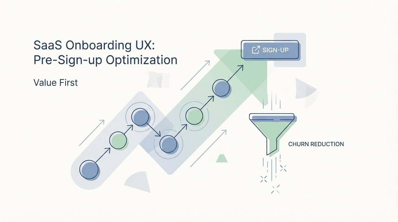
Most SaaS teams think churn starts after sign-up.
That is true in one sense, but incomplete in a more important one.
A surprising amount of churn begins before the account exists. It starts when the website creates the wrong expectation, hides important information, overcomplicates the path to value, or attracts users who were never a fit in the first place. By the time those visitors finally sign up, the failure has already been designed in.
This is why onboarding should not begin inside the product. It should begin on the website.
Your homepage, product pages, pricing page, FAQ, and demo flow all shape what users think will happen next. If those surfaces are confusing, vague, or overly polished at the expense of clarity, they create a gap between promise and experience. That gap is where early churn grows.
If you want better retention, start by fixing the pre-signup experience.
What pre-signup churn actually looks like
Not all churn shows up as cancelled subscriptions.
Some of it looks like:
All of that is retention work, even if it happens before conversion.
A website that attracts attention but sets weak expectations can increase top-of-funnel volume while quietly damaging activation quality. That is why vanity metrics can be misleading. More sign-ups do not always mean healthier growth.
Onboarding starts with message match
The first job of a SaaS website is not to look “innovative.” It is to create message match.
That means the page should connect the visitor’s problem to a believable outcome with as little translation effort as possible.
When SaaS messaging is vague, visitors fill in the blanks with their own assumptions. Then they sign up expecting one thing and find another.
Good message match usually includes:
That last point matters more than many teams admit. A website should not try to charm everyone into the funnel. It should help the right users recognise themselves.
Better-fit sign-ups usually lead to lower churn because users arrive with more accurate expectations.
Show the product early
One of the easiest ways to increase pre-signup friction is to hide the actual product behind abstract branding.
If a visitor reaches your homepage and still cannot picture how the product works, the site is making them do too much interpretive work. They are being asked to commit before they can imagine success.
That is why strong SaaS websites increasingly show:
This does two things. First, it builds confidence. Second, it filters users more honestly. People can decide earlier whether the product feels aligned with their world.
That is good for conversion quality, even if it slightly reduces raw lead volume.
Reduce friction before the form
A lot of SaaS funnels still behave as though every additional field is harmless.
It is not.
Every step before access should justify its existence. If the user has not yet experienced value, friction feels expensive very quickly.
Pre-signup friction often shows up as:
A cleaner path usually wins.
For product-led SaaS especially, the website should act like a confident guide, not a gatekeeper. Let users understand the product before you ask them to surrender time, data, or budget conversations.
Use the website to set the first success milestone
One reason trial users churn early is that they do not know what “good progress” looks like.
The website can fix that before sign-up even happens.
Instead of only talking about features, explain the first meaningful win. What should a new user achieve in day one? What outcome should they expect in the first session, first week, or first team rollout?
This works well because it shrinks ambiguity.
Examples:
When the website previews the early success path, new users enter the product with better mental models. That improves activation, which improves retention.
Pricing pages are retention pages too
Pricing is often treated like a sales page problem. It is also a churn problem.
If users sign up without understanding plan limits, billing logic, support tiers, or upgrade paths, frustration arrives fast. Sometimes churn is really just surprise with a billing date attached.
A strong pricing page reduces that risk by being easy to scan and hard to misread.
What helps:
The best pricing pages do not just push purchase intent. They lower future disappointment.
That matters because users who feel tricked are expensive to acquire and quick to leave.
Use social proof to answer doubt, not decorate the page
Social proof works best when it addresses a real concern.
Too many SaaS sites scatter logos and testimonials as generic trust wallpaper. That is better than nothing, but not by much. What usually performs better is proof matched to the objection in front of the visitor.
For example:
Case studies are especially useful here because they connect problem, process, and measurable outcome. They help prospects imagine what success looks like after the click.
That reduces uncertainty, which reduces drop-off.
Write better FAQs
A neglected FAQ creates support tickets later.
A good FAQ removes hesitation now.
This is one of the cheapest ways to reduce pre-signup churn because it helps visitors resolve the doubts that would otherwise turn into abandoned trials or poor-fit accounts.
Your FAQ should answer the questions people hesitate to ask directly:
If your FAQ is mostly filler or legalese, it is missing the point. This is a trust surface, not a content bucket.
Align acquisition with the actual product experience
Sometimes the website is not failing because it is weak. It is failing because it is too persuasive in the wrong way.
Overselling simplicity, speed, or automation may boost sign-ups in the short term. But if the product needs thoughtful setup, stakeholder buy-in, or process change, then “instant results” messaging will backfire.
Retention improves when the website prepares users for reality without making the reality feel heavy.
That means being honest about:
The paradox is useful: clearer qualification can reduce churn even if it makes the funnel slightly narrower.
Build websites that guide, not just persuade
Good SaaS websites are increasingly behaving like lightweight onboarding systems.
They do not just sell. They orient.
That might include:
These elements make the handoff into the product feel less abrupt. The visitor is not stepping into a black box. They already have context.
That kind of continuity lowers anxiety. Lower anxiety usually leads to better activation.
Metrics that matter
If you want to know whether your website is reducing churn before sign-up, stop looking only at traffic and trial starts.
Track signals that connect website quality to downstream retention, such as:
These numbers tell a more useful story than raw volume.
A website is doing its job when it helps the right people sign up for the right reasons.
The website sets the emotional tone
There is also a softer factor here, but it matters.
Before users trust your product, they trust the feeling your website gives them. Calm, clear websites suggest the product will also feel understandable. Confusing, inflated websites signal future friction, even when the product itself is good.
That emotional tone affects willingness to try, willingness to persist, and willingness to bring colleagues along.
In other words, UX starts before onboarding emails, tooltips, and checklists. It starts with how the site frames the decision.
Final thought
If your team treats the website as a separate marketing surface, you are probably underestimating its impact on retention.
The website is the first layer of onboarding. It sets expectations, filters fit, previews success, answers objections, and shapes how confident a user feels before they ever create an account.
Get that layer right, and the product has a better chance to keep the users it earns.
Get it wrong, and the churn begins before the sign-up button is ever clicked.
Turn this article into a real benchmark
Start with the free Website Grader for an instant score, then move to the full AI scan when you want page-level recommendations.
Open the Free Website Grader →