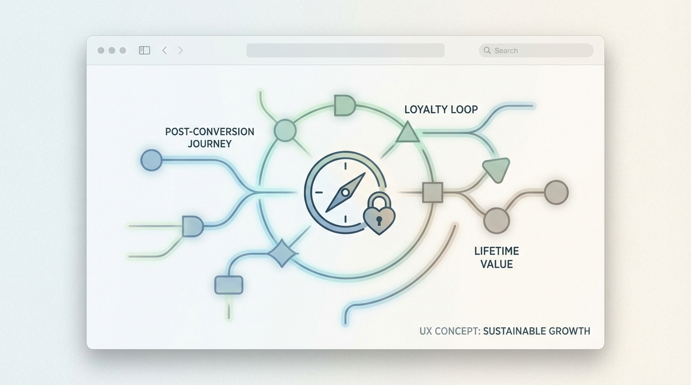
From landing to loyalty: using post-conversion UX to drive lifetime value
Getting the click is expensive. Getting the signup is harder than it used to be. But the part most teams still under-design is what happens five seconds after the conv...
Free tool
Grade your website before you keep reading
Most readers want a quick benchmark first. Start with the free Website Grader, then come back to this article with a clearer sense of what to fix.
Getting the click is expensive. Getting the signup is harder than it used to be. But the part most teams still under-design is what happens five seconds after the conversion.
That gap matters more than people think.
A lot of businesses treat the conversion as the finish line. The ad worked. The landing page worked. The form got filled. Someone booked the demo, started the trial, placed the first order, or subscribed. Job done, right? Not really. That moment is closer to a handoff than a win. If the post-conversion experience is clumsy, vague, slow, or generic, you pay for the same customer twice: once to acquire them, then again in churn, support burden, refunds, and weak retention.
Post-conversion UX is where customer lifetime value starts getting decided.
Why post-conversion UX matters more than acquisition teams admit
Most growth dashboards are still front-loaded. Teams obsess over cost per click, conversion rate, and landing page variants. Those numbers matter, but they can hide a more expensive problem downstream. A campaign that converts well into a messy onboarding flow does not create growth. It creates leakage.
Retention has always been cheaper than reacquisition. That isn't new. What has changed is how visible the UX gap has become. Users have less patience, more alternatives, and better pattern recognition. They know what a smooth onboarding flow feels like. They know when a checkout follow-up feels useful versus when it feels like abandonment in nicer clothing.
A poor post-conversion experience usually shows up in familiar ways:
None of this looks dramatic in isolation. Together, it quietly crushes lifetime value.
The moment after the click is emotional, not just functional
This is the part teams miss.
After a conversion, the user is in a fragile state. They have made a small commitment. Maybe a financial one, maybe a reputational one, maybe just a time investment. They are asking a private question: "Did I make the right call?"
Good post-conversion UX answers that question immediately.
Not with fluff. Not with some overcooked brand paragraph. With orientation.
Tell them what just happened. Tell them what happens next. Show visible progress. Reduce uncertainty. Confirm the value exchange they believed they were buying.
If someone starts a free trial, don't dump them into a blank dashboard and hope curiosity carries the rest. If someone books a strategy call, don't leave them in a confirmation page with a calendar widget and nothing else. If someone buys a product, don't make the order confirmation feel like a receipt from a vending machine.
The best post-conversion flows are reassuring without being patronizing. They feel deliberate. They make the user think, "Okay, these people have done this before."
Four post-conversion UX layers that increase lifetime value
1. Immediate confirmation with a useful next step
The thank-you page is usually wasted space. It should be one of the highest-leverage screens on the site.
A good confirmation experience does four things fast:
That next action depends on the business model. For SaaS, it might be connecting a data source or completing one setup task. For a service business, it might be uploading context before the consultation. For ecommerce, it might be setting delivery preferences, joining a care guide flow, or seeing the most relevant support info before they need it.
The mistake is offering either nothing or too much. You don't need six buttons. You need one strong next move.
2. Onboarding that gets users to value before it gets them to features
Teams love explaining their product. Users care about solving the thing that brought them there.
That means onboarding should be organized around time-to-value, not feature exposure. If your product has twelve capabilities but one clear early win, design for the win first.
This often means asking fewer questions up front, not more. Progressive profiling works because it respects momentum. Let the user get started. Earn the right to ask for more later.
A useful test: if you removed half your onboarding steps, would the user reach value faster or just become confused? Most teams are surprised by the answer.
The right onboarding flow usually has these traits:
Getting someone to their first win quickly does more for lifetime value than any desperate upsell banner you can place on day two.
3. Lifecycle messaging that behaves like product design
Email, in-app prompts, SMS updates, and account notifications are part of the UX. They are not side quests for the CRM team.
If post-conversion messaging is disconnected from product reality, users feel it instantly. A welcome email that says "you're all set" when the account is still unusable is worse than silence. A follow-up that pushes an upgrade before the customer has seen basic value feels needy.
Useful lifecycle UX is timed to user state. It nudges, clarifies, and unblocks. Sometimes the best message is a tiny one: "You are one step away from publishing" or "Your report is ready, here's what to look at first." Small interventions often beat heroic automation sequences.
Think of lifecycle messaging as distributed interface design. Same job, different screen.
4. Retention loops that feel earned
Loyalty rarely comes from one dramatic moment. More often it is built through a series of low-friction, confidence-building interactions.
If the customer keeps succeeding, they stay. If they stay, they buy more. If they buy more and the experience remains coherent, they recommend you.
That sounds obvious, but a lot of retention strategy still gets framed as persuasion. Discounts. urgency. artificial prompts. That stuff has its place, but it is fragile. UX-led retention is sturdier because it builds on actual usefulness.
A few examples:
The pattern is simple: reduce effort, increase clarity, reinforce progress.
What this means for SEO teams, not just product teams
There is an SEO angle here that people often miss. Search visibility is increasingly shaped by user signals that sit downstream of the first visit. If your pages attract traffic but your post-conversion journey produces pogo-sticking, brand distrust, weak repeat visits, and poor reviews, that cost finds its way back into search performance.
Good post-conversion UX supports SEO in a quieter, more durable way:
In other words, acquisition quality is not just about ranking. It is about what your website does with the attention it earns.
A practical audit for your current post-conversion flow
If you want to improve lifetime value, start by auditing the first seven days after conversion.
Look at the journey through three lenses:
Clarity
Can a new customer explain what happens next without guessing?
Momentum
Is there a fast path to an early win, or does the experience stall right after signup?
Confidence
Does the product feel guided and trustworthy, or does the user feel dropped into the deep end?
Then check the actual evidence:
You do not need a giant rebuild to improve this. Sometimes the win is a clearer confirmation screen, one less field, a better welcome email, or a dashboard that explains itself.
The real shift: stop treating conversion as the climax
The old mental model is still haunting a lot of websites. Traffic comes in, conversion happens, the curtain drops.
But the healthier model is this: the conversion is the point where the relationship becomes expensive enough to deserve design attention.
That is where loyalty begins.
The brands that win over the next few years will not just be the ones with better acquisition funnels. They will be the ones that make the first post-conversion minutes feel confident, coherent, and worth continuing. In a crowded market, that difference compounds.
Clicks can be rented. Loyalty has to be designed.
Turn this article into a real benchmark
Start with the free Website Grader for an instant score, then move to the full AI scan when you want page-level recommendations.
Open the Free Website Grader →