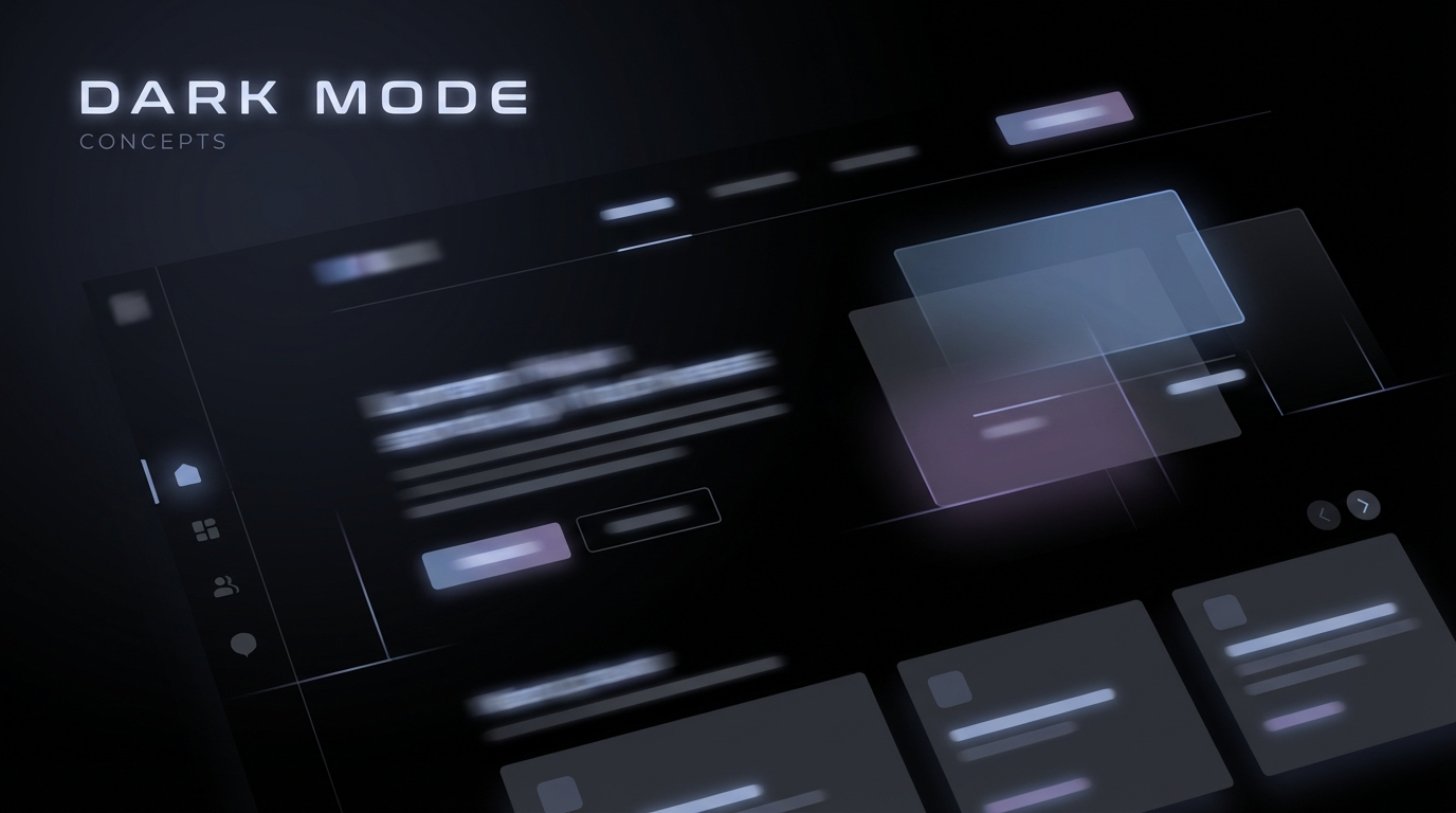
Dark Mode UX: SEO and Design Best Practices for 2026
It’s 2026, and 84% of your visitors are probably using a system-wide dark mode on their devices. If your website flashes a blinding white screen at 11:00 PM when they...
Free tool
Grade your website before you keep reading
Most readers want a quick benchmark first. Start with the free Website Grader, then come back to this article with a clearer sense of what to fix.
It’s 2026, and 84% of your visitors are probably using a system-wide dark mode on their devices. If your website flashes a blinding white screen at 11:00 PM when they click a link, you haven't just failed the "vibe check"—you've probably lost a conversion.
Dark mode has evolved from a "cool feature" to a fundamental user expectation. But more interestingly, it’s becoming a subtle but real factor in your site’s performance and search visibility.
Here is why you need to take "The Dark Side" seriously, and how to implement it without ruining your brand.
Does Dark Mode help SEO?
The short answer is: indirectly, yes.
Google and other search engines prioritize "User Experience Signals." If your site is uncomfortable to read in low light, users will bounce. If it’s high-contrast and easy on the eyes, they’ll stay longer. Higher dwell time and lower bounce rates are massive signals to search algorithms that your content is valuable.
Furthermore, on OLED and AMOLED screens (which most phones use now), dark mode can save between 30% and 50% of battery life. A site that doesn't drain a user's battery is a site they are more likely to return to. In the mobile-first world of 2026, performance *is* SEO.
The "True Black" Trap
The biggest mistake designers make is using pure black (`#000`) for the background and pure white (`#fff`) for the text.
This creates extreme contrast that causes "halations" (where the white text seems to bleed into the black background), making it actually harder to read for people with astigmatism or light sensitivity.
**The 2026 Standard:**
Handling Images and Branding
Your vibrant "light mode" logo might look terrible against a dark background. You need a strategy for your visual assets:
The Technical implementation
Don't make users hunt for a toggle. Use the `@media (prefers-color-scheme: dark)` CSS media query to respect their system settings automatically.
```css
:root {
--bg-color: #ffffff;
--text-color: #1a1a1a;
}
@media (prefers-color-scheme: dark) {
:root {
--bg-color: #121212;
--text-color: #e0e0e0;
}
}
```
However, *do* provide a manual override. Some people prefer light mode even in a dark room, and some prefer dark mode even in direct sunlight. Give them the choice, and save that choice in their local storage.
---
I’ve always found it interesting how something as simple as a color palette can completely change the "mood" of a business. Light mode feels like a bustling office; dark mode feels like a private conversation. In 2026, the brands that can handle both are the ones that actually connect. 🌌✨
Turn this article into a real benchmark
Start with the free Website Grader for an instant score, then move to the full AI scan when you want page-level recommendations.
Open the Free Website Grader →