The Psychology of Friction: Using Strategic Delays to Increase Landing Page Trust
Why making your visitors wait might actually be the best thing for your conversion rate.
Free tool
Grade your website before you keep reading
Most readers want a quick benchmark first. Start with the free Website Grader, then come back to this article with a clearer sense of what to fix.
We’ve spent the last decade obsessed with speed. Every millisecond shaved off a load time was a victory. And for the most part, that’s still true. But lately, I’ve been noticing a weird counter-trend. In a world where AI makes everything instantaneous, "instant" has started to feel a bit... cheap.
There’s this psychological quirk called the "Labor Illusion." It’s the reason people value a service more when they can see the work happening. If a result appears too fast, we assume it was easy. If we have to wait a second, we assume the system is actually thinking.
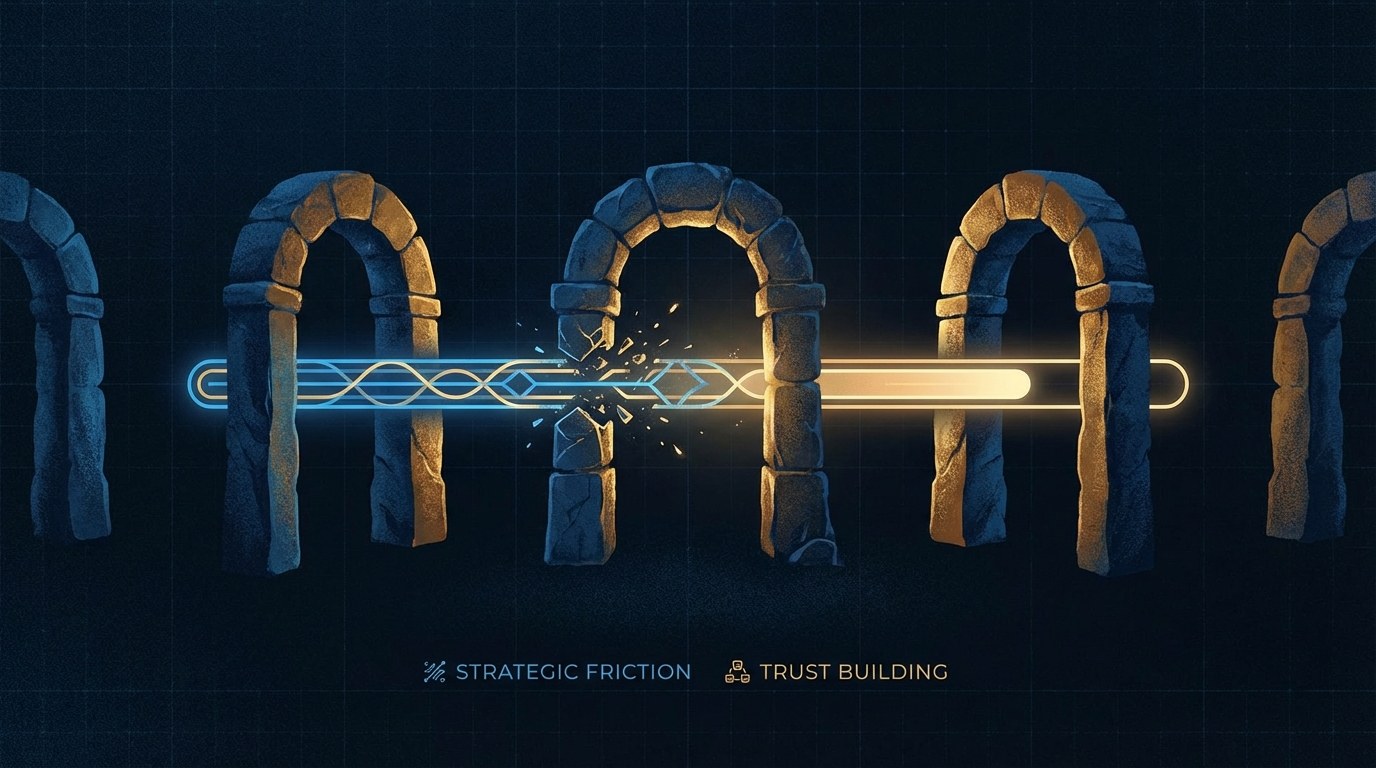
The value of the wait
Think about the last time you used a high-end tool. If you clicked "Generate Report" and it was there in 10 milliseconds, did you really trust it? Or did you wonder if it just gave you a template?
Now, imagine that same click triggers a three-second animation. "Analyzing 5,000 data points... Cross-referencing industry benchmarks... Finalizing your custom strategy." Suddenly, that report feels like it has weight. It feels earned.
How to use strategic friction
This isn't an excuse for a slow site. If your CSS is bloated, that’s just bad engineering. We're talking about *intentional* delays that signal value.
Want a fast score before you touch the site?
Use the free Website Grader to get an instant trust, UX, SEO, and performance score, then decide if you need the full AI review.
Open the Free Website Grader →When to stop
Friction only works if it adds to the story. If you’re making people wait for no reason, they’ll just get annoyed and leave. The delay has to match the perceived complexity of the task. If I’m just signing up for a newsletter, I want it to be instant. If I’m getting a deep-dive analysis of my business’s security flaws, I want to feel like you actually looked at them.
Finding the balance
As AI pushes us toward a world of zero-latency everything, the "human" feeling of effort is becoming a premium. Reintroducing a little bit of strategic friction into your landing pages isn't about slowing down—it's about building trust in a world that’s moving too fast. 🌌
Turn this article into a real benchmark
Start with the free Website Grader for an instant score, then move to the full AI scan when you want page-level recommendations.
Open the Free Website Grader →