The Ghost of Abandoned Carts: Fixing E-commerce Checkout Friction
Why are your customers vanishing at the finish line? We look at the 5 biggest checkout friction points and how to fix them.
Free tool
Grade your website before you keep reading
Most readers want a quick benchmark first. Start with the free Website Grader, then come back to this article with a clearer sense of what to fix.
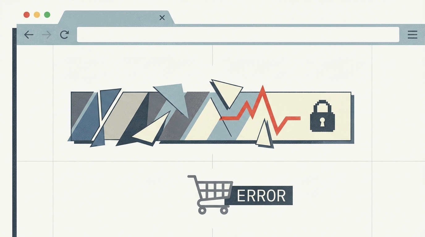
# The Ghost of Abandoned Carts: Fixing E-commerce Checkout Friction
You spend thousands on ads. You obsess over product photography. You finally get someone to click "Add to Cart." And then? Nothing. They vanish.
In 2026, the average e-commerce abandonment rate still hovers around 70%. Most of that happens at the checkout. It’s the digital equivalent of a customer walking to the register with a full basket, seeing the line, and just walking out the front door.
Checkout friction is the silent killer of conversion rates. If you want to stop leaving money on the table, you need to identify where the friction is hiding.
1. The Forced Account Creation Trap
This is the biggest mistake you can make. Requiring a user to create an account before they can pay is like asking for a first date's social security number. It's too much, too soon.
**The Fix:** Always offer a guest checkout option. You can ask them to save their details *after* the purchase is complete. By then, the transaction is done, the dopamine is hitting, and they’re much more likely to say yes.
2. Surprise Costs at the Finish Line
Nothing kills a sale faster than seeing a $50 product turn into a $75 order once shipping, taxes, and "processing fees" are added in the final step. It feels dishonest.
**The Fix:** Be transparent early. If you can’t offer free shipping, provide a shipping calculator on the product page or cart. Better yet, bake the shipping cost into the price and offer "Free Shipping" across the board. The psychological boost of "Free" usually outweighs the slightly higher price tag.
3. Too Many Fields, Too Little Time
Does a customer really need to provide their middle name, their landline number, and "How did you hear about us?" just to buy a pair of socks? Every extra field is a reason to quit.
**The Fix:** Audit your forms. If you don't need the data to ship the product or process the payment, delete the field. Use address auto-complete (like Google Maps API) to turn a 5-field address block into a single, fast interaction.
4. Lack of Payment Diversity
If a customer wants to pay with Apple Pay or crypto and you only take Visa, you’ve lost the sale. In 2026, convenience is the currency.
**The Fix:** Integrate one-click payment options. Shop Pay, Apple Pay, Google Pay, and PayPal are non-negotiable. For high-ticket items, consider "Buy Now, Pay Later" (BNPL) options like Klarna or Afterpay.
5. The Mobile Mismatch
If your checkout looks like a desktop site shrunk down to fit a phone, you're losing the 75% of users who shop on mobile. Tiny buttons and unreadable text are the ultimate friction.
**The Fix:** Design mobile-first. Ensure buttons are thumb-sized (at least 44x44 pixels). Use the numeric keypad for credit card fields and phone numbers. Make sure the "Place Order" button is always accessible without endless scrolling.
Conclusion
Checkout optimization isn't about one "magic button." It's about removing the dozen small hurdles that stand between your customer and their purchase. Clean up the friction, and the sales will follow.
Turn this article into a real benchmark
Start with the free Website Grader for an instant score, then move to the full AI scan when you want page-level recommendations.
Open the Free Website Grader →